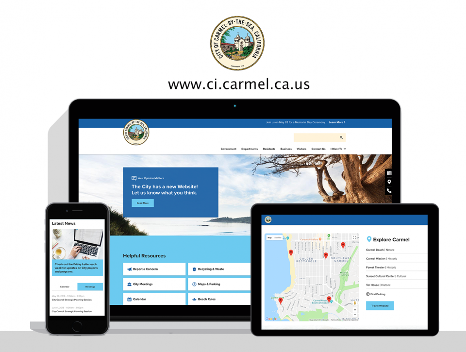
Enhancing the user experience for the City of Carmel
The city of Carmel-by-the-Sea is one of the nation’s most desirable places to visit, work, and live. The unparalleled natural beauty, preservation of downtown character, clean ocean air, beautiful beach, and charming neighborhoods contribute to the quality of life enjoyed by residents and visitors alike. When we found out we’d been chosen to help shape their new website we were thrilled, to say the least.
The challenge
Everything about Carmel is unique, including the way local businesses operate. Carmel has intentionally sidestepped implementing street addresses, street lights, neon signage for businesses, and similar items that could potentially take away from their deliberate culture. Creating a website that would empower business operators to thrive in this unique environment is key.
Everything about Carmel is unique, including the way local businesses operate.
Apart from business and operations, residents of Carmel are also far more engaged than your average citizen. They are active in town hall meetings, turn out in droves for community events, and cherish their beloved library. Understanding this, we immediately knew it would be key to create a website dedicated to keeping residents informed and inviting them to collaborate as partners in the community.
Finally, although tourism is a large part of the Carmel experience, there was already a separate tourism website. Therefore we would need to create a site that visually captured the charm and culture of Carmel while seamlessly managing the handoff between these two distinct websites and functions.
The Transformation
Enhancing community engagement: The new homepage does an outstanding job of bringing the community together and providing them a space to weigh in on key topics. Latest news, calendar events, and access to sign up for regular updates ensure the website is helping to build a stronger community and supporting those who want to be involved.
Bringing key answers and resources front and center: By polling Carmel residents and business owners on their key needs, we were able to create a fun set of visual quicklinks that answer the most frequently asked questions. From parking to beach rules to business permits, website visitors can quickly find their answer and go about their business.
Completely revamping the Carmel library website: By utilizing our microsite technology, we were able to give the city library an entirely new look and feel. Check it out here.
Streamlining information architecture for a more effective website experience: Through evaluating analytics, we understand that you only get a couple of clicks to satisfy your visitors’ needs. Accordingly, we worked with the Carmel team to prioritize and streamline the navigation experience so visitors can quickly and intuitively find what they are looking for.
Infusing the culture of the city: From the coastal color palette to the inviting imagery of surfers, shops, and the beach, you can feel the vibe of this one-of-a-kind destination throughout the site.
Creating an outstanding Mobile Experience: Finally, it was key that we deliver an outstanding experience on every device. Since the launch of the site, we’ve seen tremendous mobile usage and engagement on the site. Currently, nearly 50% of site visitors use their mobile devices to access the site.
We’re so proud of what we were able to accomplish together with the City of Carmel and believe their new website will have a profound impact on the community they serve.
Let’s work together
If you have a project with similar needs, let us know. We’d love to learn more about it and walk you through a free demo or consultation.

