Pension Playbook
Best practices and the latest data-driven design trends for retirement system websites
The Most Popular Content Management Systems in Pension — 2020
There are lots of options when choosing a content management system (CMS) for your public-facing pension system website. From open or closed source to flexibility, from ease-of-use to security and performance, there is a lot to consider! To make this process a bit easier, we took a deep dive to better understand what tools pension systems in 2020 are using to power their public websites.
How we evaluated CMS usage
By working with our pension partners in cities, counties, states, police, and fire organizations across the country, we were able to compile a database of nearly 400 retirement systems throughout the United States and Canada. No system was too big or too small for this exercise. Once our list was assembled, we carefully researched each website to understand what CMS platform or website tools they were using. The results were fascinating.
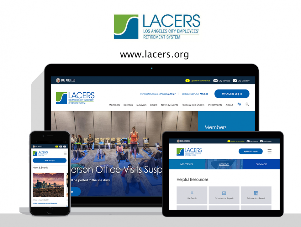
Los Angeles City Employees’ Retirement System launches modern, stunning website
Established in 1937, The Los Angeles City Employees’ Retirement System (LACERS) provides pension benefits and administers a retiree health care program to more than 26,000 active city employees and over 20,000 retirees and their beneficiaries.
After years of dealing with an outdated website and complicated content management tools, LACERS came to Digital Deployment, seeking a new pension website and online platform that would empower them to transform their customer experience online.
Read on to discover a few of the more impactful elements of this project.
Online Pension Innovation Webinar
Five pension systems that are leading the way
See pension technology and communications trends up close and leave with a practical, easy-to-follow checklist to ensure your site is ADA-compliant. Sign up for this three-part series of 20-minute webinars to learn how to bring these emerging trends to your members.
The secret to building member engagement and success early
Focus on key life events and milestones
[This is the second of a series of posts on the latest data-driven design trends for retirement systems.]
As we alluded to in our first post of the series, member engagement consistently trends upward as members get closer to retirement. The reasons are obvious: members nearing retirement start fantasizing about a life untethered from phrases like “work-life balance” and begin paying attention to what it will take to make the jump to their next phase. Meanwhile, new retirees suddenly become very interested in monitoring those pension payment dates and finding out what kind of COLA they can expect.
That’s great. However, as the team responsible for setting retirees up for success, we know that early member engagement leads to a better pension experience, healthier long-term retirement decisions, and (selfishly) fewer customer service requests over the lifetime of the member.
So, what’s the secret to building member connections earlier in their careers? Build a quality experience around key life events.
Tips for posting payment dates on your retirement system website
[This is the first of a series of posts on the latest data-driven design trends for retirement systems]
 For retirement systems, the member
experience is the brand, and while we do occasionally see
revolutionary design and technology shifts (e.g. responsive
design), it’s often the little things that will delight your
users the most.
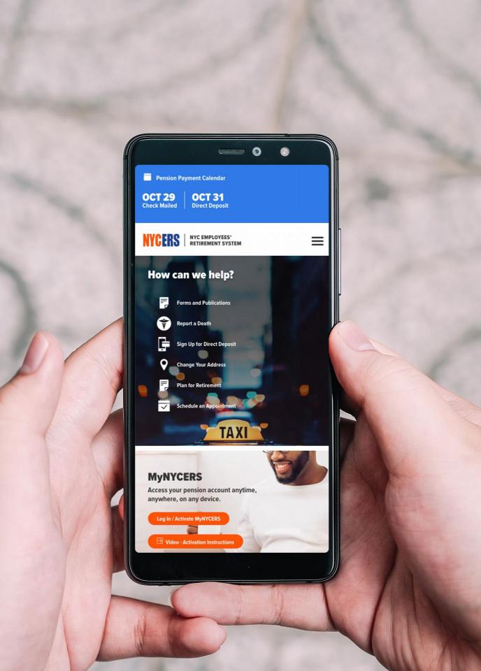
This week, we’re offering some tidbits we first learned by working with the New York City Employees’ Retirement System (NYCERS): Post pension payment dates on your website!
NYCERS serves over 350,000 members and fields an incredible number of support calls daily. When we began redesigning their website, our first order of business was to conduct focus groups with their customer service team to learn how the website could proactively reduce employee workload and increase customer satisfaction. To our delight, the top requests were simpler than we thought:


