How do I build the right academic program finder for my school’s website?
Best practices, checklists, and examples
We get this question a lot. Everybody is talking about guided pathways and how to successfully bring them to their community college website. This new focus on student success is exciting and opens a world of opportunities, but it also brings up a lot of questions, especially when it comes to putting these ideas into practice. Don’t worry, we’re here to help!
In this article, we’ll guide you through one of the most important pieces to executing guided pathways on your community college website: developing an academic program finder for your students. This single effort will have a profound effect on the success of your entire student body, as well as the workload of your staff, but for this tool to be effective, it must be done right.
Read on to find best practices, checklists, and design examples that will guide you through how to build this key resource on your community college website.
What is an academic program finder?
An academic program finder is a tool designed to empower students to see the world of opportunity in front of them and pursue the right course of study for their personal goals.
Rather than displaying a complex or overwhelming list of options, a program finder guides the student to their ideal path by meeting them at their level and helping them intuitively narrow their selections based on specific interests, needs, or goals.
Ultimately, the program finder is one of the most valuable pieces of real estate on a community college website because, unlike many other pages on your site, students will rely on it throughout their entire student journey–and the ways they utilize it will evolve over time.
What does success look like?
Before we jump into exactly how to build a program finder, it’s important to understand the outcomes you’re building toward. Done correctly, an academic program finder will:
- Guide students seamlessly to the right program for them, based on their goals and interests.
- Support program comparison and encourage informed decisions.
- Welcome students back as they progress through their student journey, providing direct access to the program maps, courses, & specifics they need to stay on track and manage their success.
- Alleviate support requests for overworked academic counselors and support personnel.
- Open up a world of opportunity for each student that attends your school.
Getting Started: A proven checklist for building your new program finder
Here are a few of the best practices and guiding principles that we’ve learned from the schools we’ve worked with. Your program finder can take many forms, but if you nail each of the items in the following checklist, you’ll be in great shape.
Quick access to view all programs
Providing a quick view of all your programs may seem obvious, but it is really easy to overlook when you start building out fun, new tools.
Be sure to include:
- A simplified view of all programs - Avoid bombarding students with too many visuals when building a simple program list. It needs to be easy to scan, at a glance.
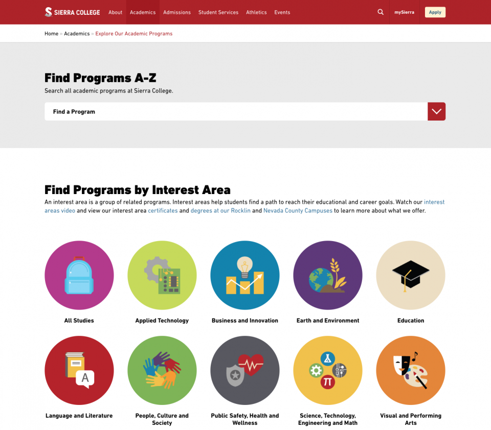
- Fast access to a specific program for laser students - Throughout their journey, students will need to get back to their program page for guidance and planning. Look for ways to help students jump directly to their program without having to dig around. Sierra College did this well by combining their program list with a predictive typing tool that empowers students to quickly type in the first few letters of their program and access it with ease.
Pathway-focused discovery & program filters
Pathway discovery tools are where things get fun. Be sure that your students have multiple ways to filter and discover programs, based on their needs, interest, and even career goals. We highly recommend incorporated images or icons to engage students and ease the burden of those who are not native English speakers.
Be sure that your program finder can:
- Filter programs by interest – Allowing students to filter by interest area opens up a world of opportunities to new students.
- Filter programs by outcome/degree type – Allowing students to filter by outcome/degree type will ensure that they can on spend time evaluating options that align with their personal goals (degree, transfer, career advancement, enrichment, etc.).
- (Extra credit) Filter by career goals – This is an exciting new way to meet students at their level and deliver options that are truly based on future outcomes.
Easy preview options
Your students’ time is precious. Make sure students can find a quick preview of essential program details before clicking through to visit the page.
Be sure your preview includes:
- Program description – A quick sentence about the program will help students proactively answer a lot of questions before diving into the full details.
- Degrees or credit options that are available for that program – A quick icon or list of the credit types are essential for discovering whether the program they are interested in can help them accomplish their goals.
Access to non-credit, enrichment options
For all of the positive buzz that guided pathways receive, there is a healthy amount of concern that non-credit and enrichment programs/courses will get lost in the shuffle. Be sure that doesn’t happen to your school.
Methods to address this:
- Add a filter to your program finder that is dedicated to the enrichment and lifelong learning programs.
- Create dedicated quick links or promotional tools that help the community find these programs.
Consistent content strategy
Once a student has found the program page(s) they are interested in, make it easy for them to research, compare, and take action.
Each detailed program page should be consistent and include the following:
- Program overview – Allow students to quickly understand what the program entails and how that might differ from a similar program.
- Program outcomes – Share the career options and possibly what salary ranges a student can expect by engaging in a certain program.
- Program maps – Program maps are at the heart of the guided pathways philosophy. Make sure that students have the tools to effectively chart their course without getting lost along the way.
- Quick access to help & support – Offer quick links on the page that allow them to speak with a counselor or even being the enrollment process.
Quick access to help & support
The program finder page will be a resource for students in all phases of their academic journey and is a natural place to promote help and assistance.
Be sure to highlight intuitive links to:
- Counseling & support - Create a link where students can easily reach out to a counselor or schedule an appointment. If staffing is available, a live chat option is an easy addition to the page that could proactively help students throughout the process.
- Career exploration tools - Tools like career coach from EMSI offer some really interesting assessment options that can help students take a step back and make smarter choices for their future.
Design Examples & Inspiration
As we see below, there are a lot of exciting ways to design an effective academic program finder. Each example takes a slightly different approach but delivers an engaging and helpful experience for the user.
Sierra College
Website: https://academics.sierracollege.edu/explore-our-academic-programs
Design Strategy: Icons, Imagery, & Clean User Interface
Highlights
- Sierra College does a beautiful job utilizing large, colorful icons to guide drive students to their ideal interest area where they can continue to narrow their search.
- For laser students, Sierra College offers a complete drop-down of all available programs, that can quickly be narrowed by typing the first few letters of a program name.
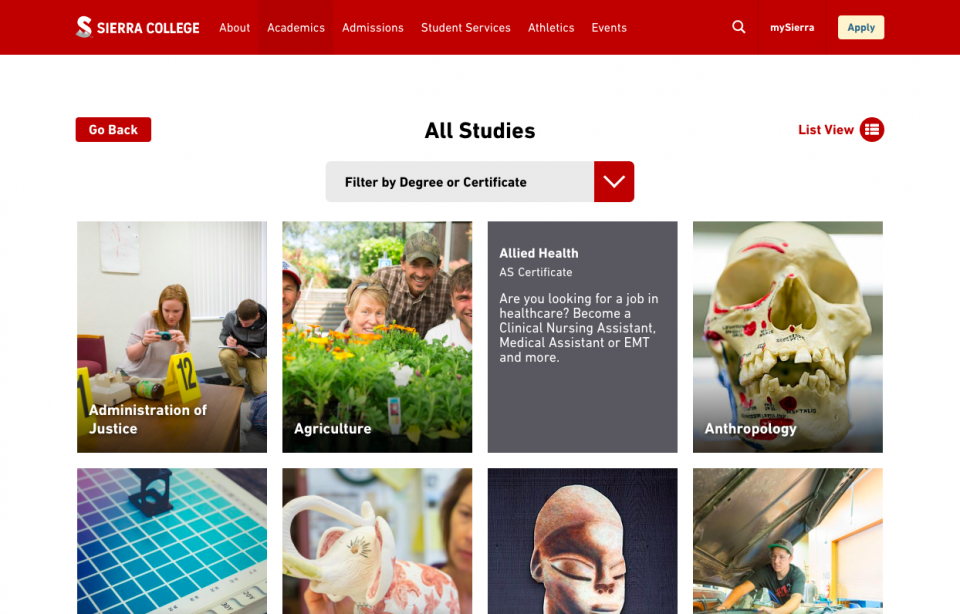
- As visitors narrow their search within an interest area, they are able to filter by degree options and even preview specific programs by hovering over their large, visual tiles.
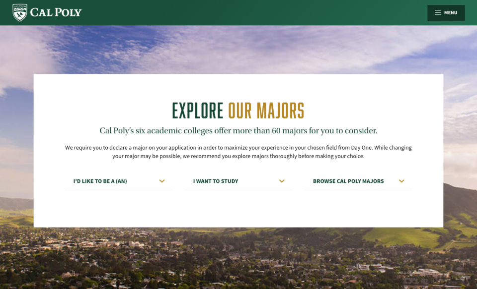
Cal Poly, San Luis Obispo
Website: https://www.calpoly.edu/undergraduate-education
Design Strategy: Minimalist Design & Natural Language
Highlights
- Cal Poly’s minimalist design asks three simple questions. “I’d like to be…”, “I want to study”, “Browse Cal Poly Majors,” easily meeting students at their level and providing answers without overwhelming.
- Cal Poly’s career-focus aligns seamlessly with the guided pathways approach.
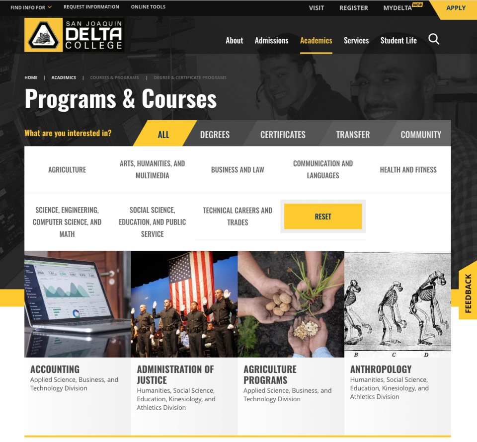
Delta College
Website: https://deltacollege.edu/programs-courses
Design Strategy: Image-heavy, tiled approach
Highlights
- Delta engages students and invites them to explore by asking them, “what are you interested in?”
- Delta provides both degree filtering options and interest options directly on the homepage.
- The use of images makes it easy to imagine what a program might entail, at a glance.
Extra Credit: Resources for bringing your design to life
Throughout this article, we mentioned the importance of including images and icons. However, your community college shared drive might not be bursting at the seams with high-quality images and artwork. Here are a couple of quick, affordable resources that can make your life a lot easier.
Photography – Authentic imagery is always the best, but when you have so many program pages to design and diverse interests to represent, we recommend checking out a tool like Unsplash, which offers high-quality stock photography for free. For projects like these, it can be a lifesaver!
Icons – For a wide variety of high-quality, affordable icons, we recommend checking out the options at Iconfinder. Their subscription services are affordable and they provide a wide range of styles and options which can be extremely helpful for this type of project.
Have questions or feedback to share?
We are committed to helping community colleges transform the student experience by implementing guided pathways on their websites. If you have any questions about this topic or anything else related to your website, feel free to reach out. We’re always happy to help!
What are community college Guided Pathways?
What you need to know to get started
For so many people across the country, community colleges are a gateway to a brighter future and a better life.
Community colleges offer a wide range of programs, courses, and transfer possibilities at a price point designed to empower equity and access. Still, with such a wide variety of options and opportunities available, it’s really easy for students to get lost along the way or lose sight of their goals before they have the chance to achieve them.
Recently an exciting, new approach emerged that is drastically transforming community college outcomes and experiences: Guided pathways.
In this post, we discuss the guided pathways model and outline best practices that will help you better support students through your college website.

